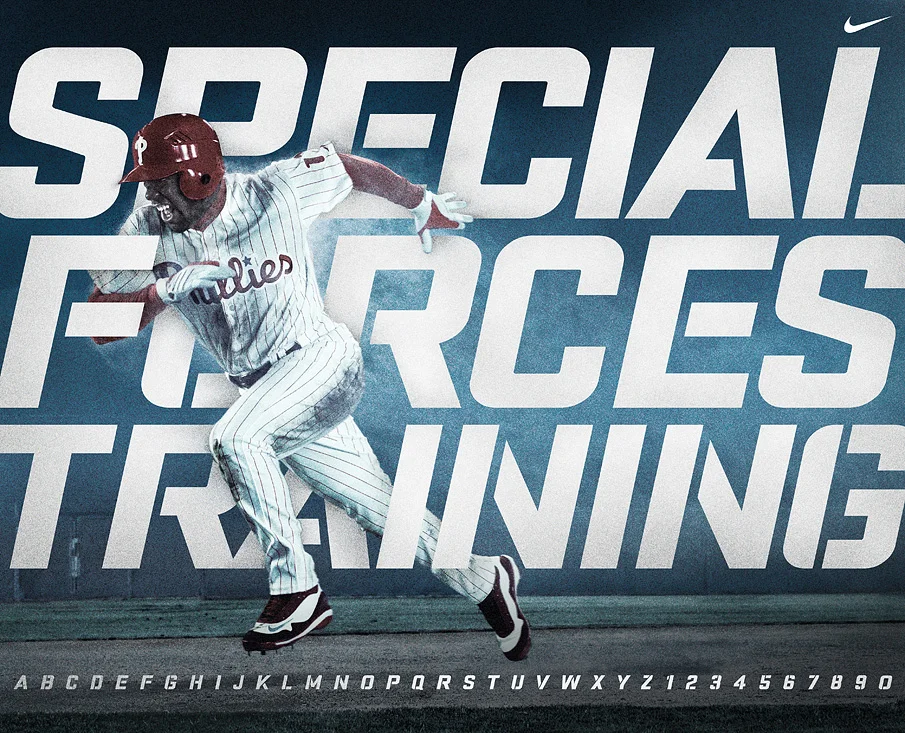

I developed the Special Forces Training typeface to support the Nike Pro Combat retail campaign in 2009. This was a pivotal time for the Nike Pro brand as they battled against Under Armour for athlete loyalty. Nike Pro Combat was a revolutionary line of lightweight and padded uniforms that are widely viewed as a historic turning point in uniform design that paved the way for modern, dynamic jerseys.
My design brief was to create a retail display font that felt aggressive, yet precise and was bold enough to cut through the crowded sportswear retail environment. I achieved this by including elements of stencilled military type on a bold italic typeface that still feels authentic today.