
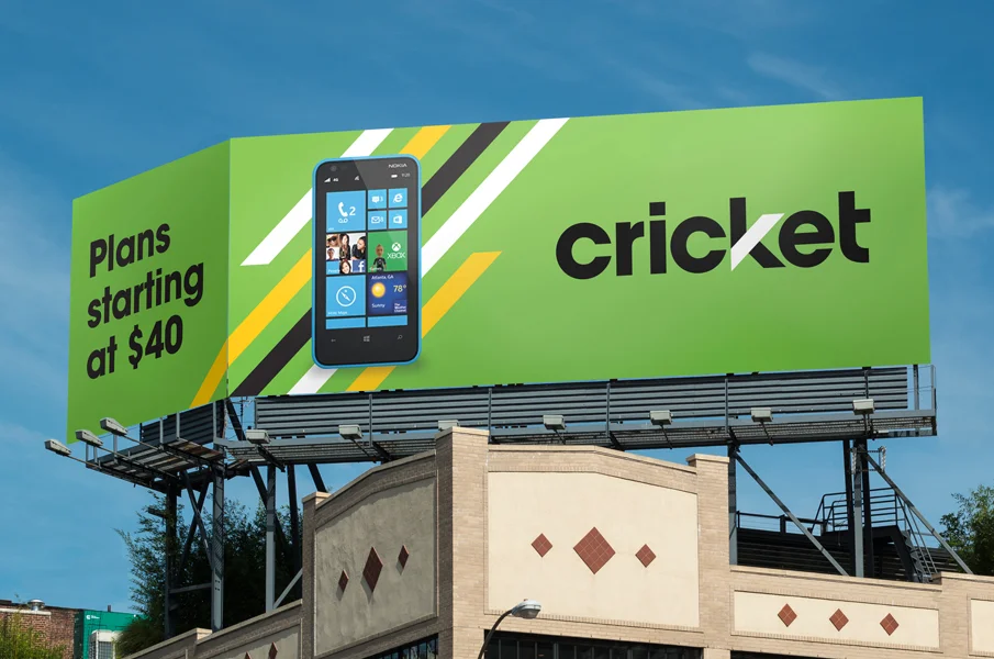
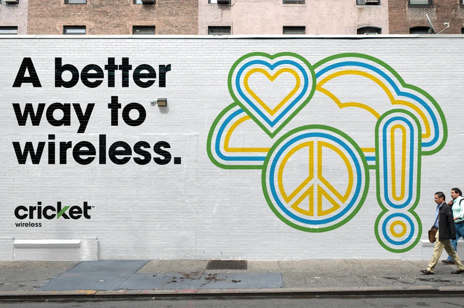

In a sea of high-cost wireless carriers, Cricket made a name for themselves as a low-cost alternative. But as shoppers began to understand the full gamut of choice in the category, the landscape began to shift. “Cheap” was no longer enough to differentiate Cricket from the low-cost tier. They needed a make-over. Cricket challenged themselves to go beyond price by creating a better offering and challenged Interbrand to give them a new look to signal this change.
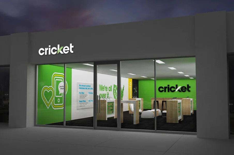
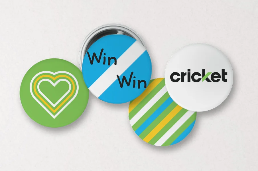
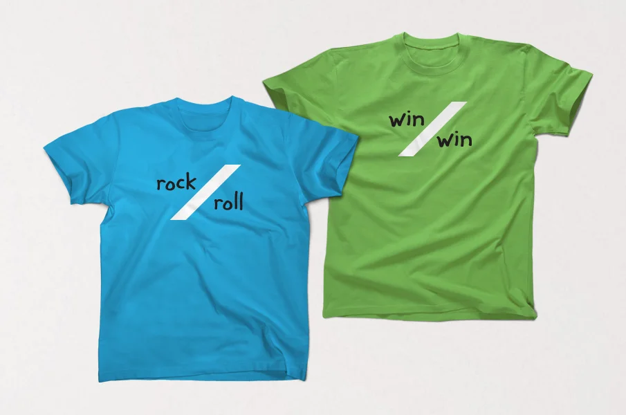
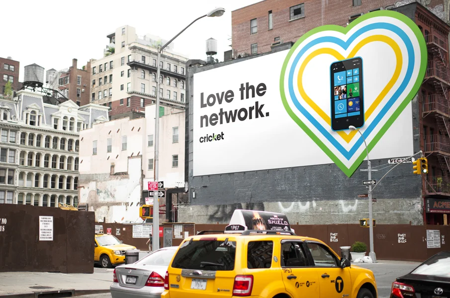
Our visual evolution created a strong but crisp new presence. The logo still emphasized the “k” but with the added element of a green stripe that could anchor the brand across illustrations, patterns and animations. Supplementary colors help to energize the visual palette beyond green. To anyone interacting with the brand, the reimagined Cricket clearly communicates simple, smart value.